Saturday, 8 March 2014
Friday, 7 March 2014
Tuesday, 4 March 2014
Contents Construction
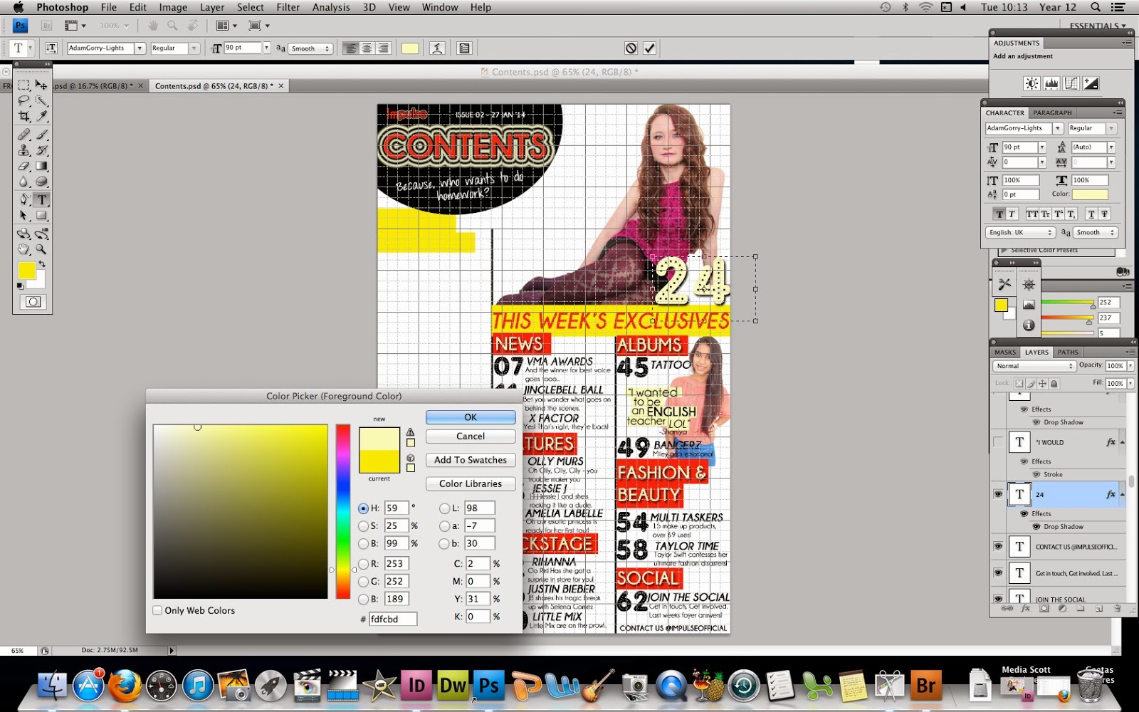
I started off with a blank A4 piece 800 by 1500 in Adobe Photoshop CS4 with grid lines to help me divide my columns equally.I have kept the background as white as all the magazines I have researched have white backgrounds for their contents page.

I then added two columns lines to make an overall of 3 columns, which is a convention in all the music magazines I have researched.
From my research I found that in the contents page of a music magazine there tends to be an overall main image who is not the double page spread article. Therefore, I have issued my contents main image in the top right hand square. I have removed the background so that it does not clash with the white page background.
I have placed the title of my contents page in the top left hand corner of the page. This has been placed inside a cut off black circle. The text 'Contents' is issued in red with edited pale yellow rings around to continue the house style of my magazine.
 I placed a yellow rectangle about the width of two columns to be the background of the heading 'This week's exclusives'. This has been written in block capitals and in red so that it provides a stark contrast between the red and yellow. The font I have used throughout my magazine pieces is 'Champagne and Limosines' The heading conveys that it is a weekly magazine and therefore has around 60-70 pages.
 Underneath the heading, I placed 6 subheadings in block capitals and in a pale yellow to allow it to almost shout out to the reader. The subheadings consist of 'News' which allows the reader to know what is going on in the pop music industry at this moment in time, 'Features' this includes all the double page spread articles that are featured in the magazine, 'Backstage' performances and interviews from artists behind the stage are included so the reader gains a closeness with the artist/band, 'Albums' this topic allows the reader to learn more about an upcoming album by a pop artist, 'Fashion & Beauty' this section accentuates the girly target audience the magazine is based upon and the 'Social' aspect allows readers to get into contact with the magazine and receive feedback.
 The pale yellow does not stand out bright enough therefore I added a bright red text background to allow the subheadings to radiate. I did this by selecting the colour box and making it the brightest red which also links into my house style.
 I added a slogan 'because who wants to do homework?' which is also a rhetorical question relating to my target audience ranging within ages 12-18. It's a playful slogan and it does not have a literal meaning. I have made the font of this 'Twin marker' as this gave a handwritten effect. Moreover, I added the magazine title 'impulse' near the top left hand corner as well as the issue number and date. The magazines I have researched on all have shown the magazine title continued onto the contents page.
Within my house style the numbers have always been accentuated in the font 'Adam Glory Lights'. I chose this font because it conveyed a fun artistic approach.
After I added in all of the numbers near the column lines I placed. I then added the contents text which is the font 'champagne and limosines' and from my research I found that in Kerrang magazine, they tend to add a short personal sentence beneath the feature which represents a closeness with the reader and the magazine.
After adding all the features within my magazine, I added an image which is almost like a background to the text. The reason for this image is that magazines tend to have more than one person included in the contents page. As you can see from the clothing of both images, it is very bright, pink and girly. The image has been placed to indicate a feature in the albums section of the magazine.
I added a quotation to go with the image with a pale yellow background to allow it to stand out. I also included a pale yellow page number for the article regarding the main contents image. From magazine conventions I found that the page number next to a main image is considerably larger than the other page numbers. The font is 'Adam Glory Lights' and the pale yellow is used so that it does not clash with the main image's outfit. To the left hand side I have placed bright yellow text backgrounds underneath the masthead.
Similarly to the front cover of my magazine I included the 'Impulse Official Chart' section as this allows the reader to be aware of the music happenings during the past week. The effect of the 'impulse' is to mirror the masthead on the front cover and the word 'official' has been placed in bold which allows it to look - official as though only this magazine has this 'official' chart.
I then allocated the numbers in 'Adam Glory Lights' down the left hand side of the column. I have left a gap between the number 4-5 which I will place an image of my front cover model, this is because from my magazine research the artist on the front cover given more significance and priority throughout the contents onto the double page spread.
I took off the grid lines as I had a clear understanding of the placement of the contents of my magazine. Towards the right hand side of the first column I placed a logo for the social network site 'instagram'.
I placed the facebook and twitter logo as I found that magazines such as NME, Kerrang! and We<3Pop tended to have references to social network sites to promote and widen their audience. I placed a quote next to the main contents image
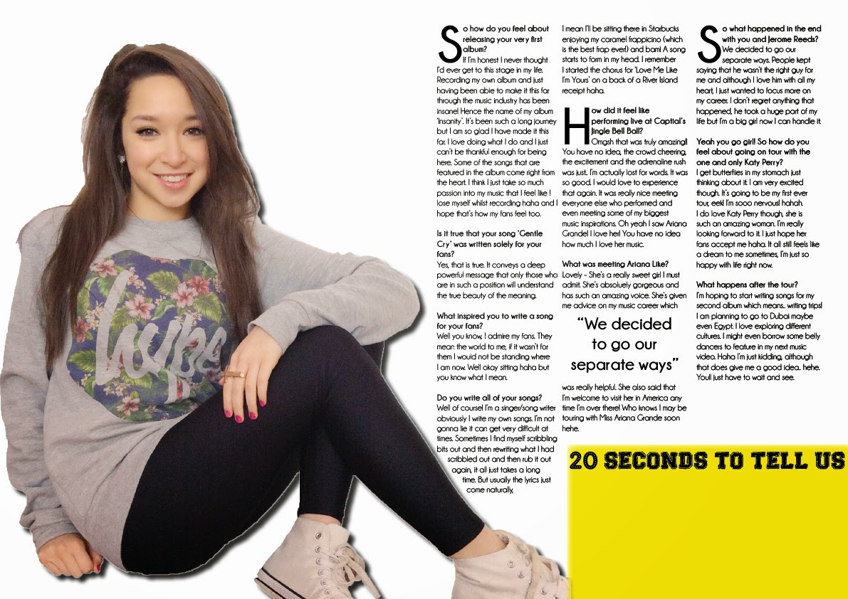
After this, I added a list of songs from a recent pop music chart onto my magazine. I also included the double page spread article in the chart review as her singing into a microphone relates to the actual double page spread. I have placed a pale yellow text beneath the songs in the chart review to add a splash of colour. Lastly, I removed the column lines and that is my final contents piece.
Subscribe to:
Comments (Atom)


